
Creating an annual report is an important task in any organization. It shows the company’s yearly performance and future prospects. While preparing the report, you must make sure that it not only communicates the important information but also reflects the brand identity. You can achieve this by using colour theory. In this blog, we will guide you on how to choose colour in annual report design. You can use it to enhance readability, highlight key information, and create an aesthetically pleasing document.
Understanding Colour Theory
Colour theory is the study that tells us how colours interact with viewers and each other. Furthermore, this theory involves an understanding of the colour wheel, colour harmony, and the psychological effects of colours. Before moving ahead, let’s understand the different types of colours present around us.
- Primary Colours: These colours cannot be created by mixing other colours. E.g., Red, blue, and yellow.
- Secondary Colours: These are created by mixing two primary colours. E.g., Green, orange, and purple.
- Tertiary Colours: These are created by mixing primary and secondary colours, such as blue-green or red-orange.
Colour theory also includes various other concepts such as hue, saturation, and brightness. All of these are different attributes of the colour and help us use them better.
- Hue: The shade of a colour, such as red or blue.
- Saturation: The intensity or purity of the colour. High saturation means the colour is vivid; low saturation makes the colour appear more washed out.
- Brightness: How light or dark a colour is. Adjusting brightness can change how colours interact with each other.
If you want to see how colour theory can really breathe life into your digital and physical designs. You should definitely check out the print design work by Designrush. Their print design creatively blends colours, visuals and text, making memorable marks in the world of advertising.
How to Choose a Colour Scheme?
Now that you have understood the basics of colour theory, it’s time for you to learn how to select a colour scheme for your annual report.
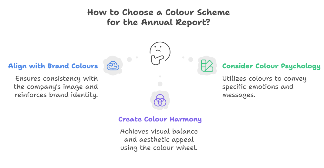
- Align with Brand Colours: You should start with company colours as this way, you can maintain consistency with the company’s image. Furthermore, this also ensures that your report is in alignment with other corporate materials. Brand colours are an important tool to reinforce the company’s identity and create a consistent look across all the marketing materials.
- Consider the Psychology of Colours:
- Blue: Trust, loyalty, and stability. Commonly used in financial and corporate sectors.
- Green: Growth, harmony, and freshness. Ideal for environmental and health-related reports.
- Red: Energy, passion, and urgency. Effective for highlighting critical information or calls to action.
- Yellow: Optimism, clarity, and warmth. It can be used to draw attention to important sections.
- Neutral Colours: Black, white, and grey provide balance and can be used as backgrounds to make other colours stand out.
- Create Colour Harmony: Maintaining colour harmony in your report is important; you can use the colour wheel to create a harmonious colour scheme.
- Complementary Colours: Colours that are entirely opposite to each other on the colour wheels are a great compliment to each other.
- Analogous Colours: Colours next to each other on a colour wheel are harmonious in nature.
- Triadic Colours: Three colours evenly spaced around the colour wheel, such as red, yellow, and blue.
- Monochromatic Colours: Different shades, tints, and tones of a single colour.
Implementing Colour in Your Annual Report
- Cover Page: Use bold and primary brand colours to make a strong first impression, complemented with neutral tones to avoid overwhelming the reader.
- Headers and Subheaders: Use contrasting colours to set a clear hierarchy of information flow.
- Charts and Graphs: Use consistent colour schemes to colour-code data for easy understanding.
- Highlighting Key Information: Use bright or contrasting colours to draw attention to key figures and quotes.
- Backgrounds and Text: Light backgrounds with dark text generally work best to ensure readability.
- Consistent Colour Themes: Use a limited colour palette to maintain a unified and professional appearance.
Best Practices for Colour Usage for Annual Reports
- Maintain Consistency: Use a limited colour palette to achieve continuity and avoid visual noise.
- Test for Accessibility: Use tools like a colour contrast checker to ensure readability for everyone, including those with colour vision deficiencies.
- Cultural Considerations: Be mindful of cultural connotations associated with colours if your report will be published globally.
- Use Colour to Enhance Structure: Break up large sections of text with colour to create visual interest and make the document more navigable.
- Keep It Professional: Ensure that colour usage remains appropriate for the subject matter and does not detract from the content’s seriousness.
Conclusion
Using colour theory effectively in your annual report can do wonders. You can enhance its visual appeal and readability. One thing you must remember is to align your colour choices with your brand identity. Moreover, testing for accessibility and maintaining consistency is key to creating a professional and effective annual report.