
Total Framework

About us
…

Brand strategy, Web design

WordPress

Cybersecurity

nehish.com
01. BRAND CONCEPT
Building a visual framework for modern architecture.
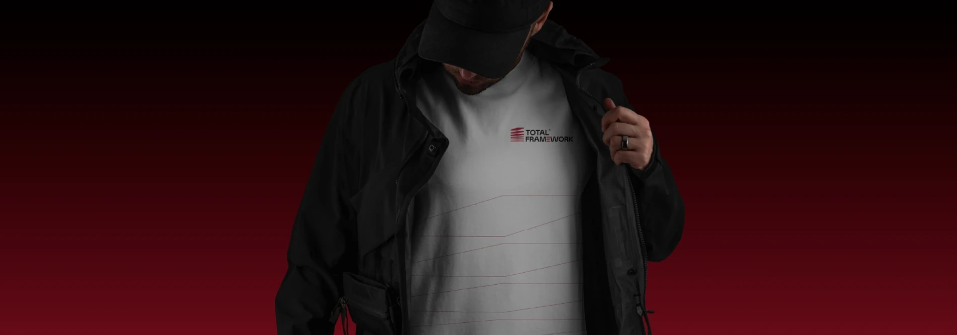
The identity was designed to reflect Total Framework’s expertise in architecture, infrastructure, and large-scale project execution. Every element balances precision, structure, and innovation.
Inspired by architectural forms and layered construction systems, the visual language communicates strength, scalability, and a
forward-thinking approach to design.
Total Framework delivers innovative, sustainable, and functional architectural solutions
02. VISUAL LANGUAGE
A system designed for clarity, consistency, and impact.
The brand system uses geometric forms, structured layouts, and deliberate spacing to create a strong architectural presence across every touchpoint.
From digital platforms to physical applications, the identity remains adaptable while maintaining a cohesive and professional visual experience.
03. Color Palette
A palette inspired by confidence and modernity.
The primary red represents energy, ambition, and innovation, while black and neutral tones reinforce professionalism, stability, and precision.
Supporting colors introduce balance and flexibility, allowing the brand to communicate effectively across corporate, digital, and architectural environments.
B31B30
RGB 179 27 48
000000
RGB 0 0 0
e6e6e6
RGB 230 230 230
3F8366
RGB 63 131 102
5B7369
RGB 91 115 105
758794
RGB 248 243 239

04. Typography
The strategic use of typography to express brand personality.
Inter
0123456789
abcdefghijklmnopqrstuvwxyz
!?@#$%&

05. Testimonials
What our clients
say about us

06. Projects
Our recent projects
07. Say Hello
Request a
free quote
Global
"*" indicates required fields