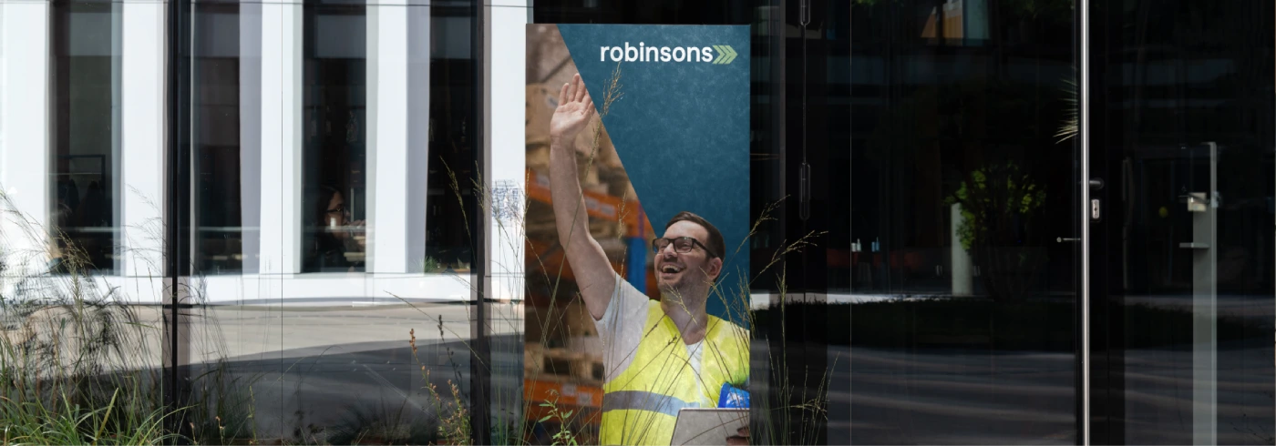
Robinsons Cargo & Logistics is a legacy-driven logistics partner, established in 1954.

01. BRAND CONCEPT
A BRAND BUILT TO MOVE WITH PURPOSE.
Robinsons has been a trusted logistics partner since 1954, carrying decades of expertise across freight, supply chain, and global trade. The rebrand was designed to honor this legacy while positioning the company for a more connected and sustainable future.
The identity balances reliability and progress through a modern visual system that reflects movement, precision, and operational excellence. Every element was created to communicate trust, adaptability, and long-term impact.
02. VISUAL LANGUAGE
DESIGNED TO BE MODULAR, FLEXIBLE, AND RECOGNIZABLE.
Inspired by logistics networks and the flow of global trade, the visual language uses geometric structures and directional forms to represent movement, connectivity, and efficiency.
The modular design system enables consistent communication across digital platforms, environmental graphics, corporate stationery, fleet branding, and marketing materials while maintaining a unified brand presence.
03. Color Palette
A PALETTE ROOTED IN TRUST, PROGRESS, AND SUSTAINABILITY.
Robinsons Blue serves as the foundation of the identity, representing reliability, professionalism, and confidence. It establishes a strong visual presence across every brand touchpoint.
Supporting greens and accent colors introduce themes of sustainability, innovation, and forward movement, creating a balanced system that feels both established and future-focused.
083F5B
RGB 8 63 91
000000
RGB 0 0 0
8CB27F
RGB 140 178 127
00859A
RGB 63 131 102
#43C1CB
RGB 91 115 105
#653025
RGB 117 135 148
04. Typography
The Strategic Use of Typography
to Express Brand
Personality.
Inter
0123456789
abcdefghijklmnopqrstuvwxyz
!?@#$%&
05. Testimonials
What our clients
say about us

06. Projects
Our Recent Projects
07. Say Hello
Request a
free quote
Global
"*" indicates required fields
